

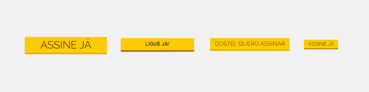
This was the primary button, with different sizes and font inconsistencies at NET websites.
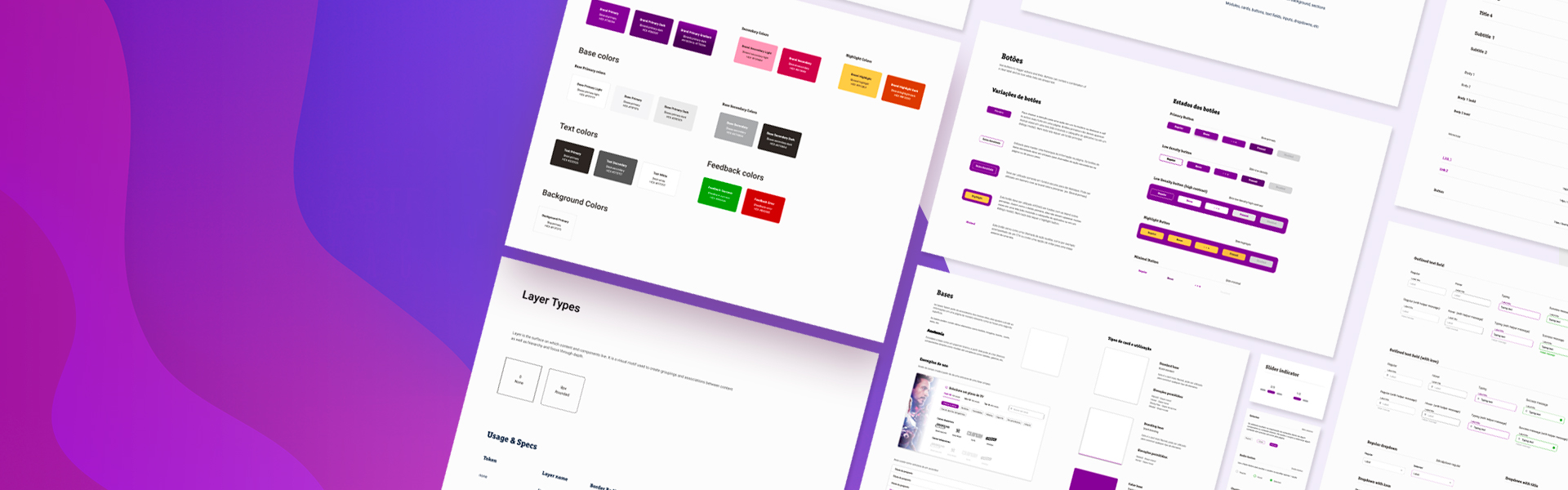
The first component library and styleguide, inicially used at NET websites, with all inconsistencies fixed and created a guide for component's usage.
“ Empty your mind. Be formless, shapeless, like water. Put water into a cup, it becomes the cup. Put water into a teapot, it becomes the teapot. Water can flow or creep or drip or crash. Be water, my friend. “
-Bruce Lee
Design and dev teams defining how would be the taxonomy.It was used the design tokens (or variables) to name it.
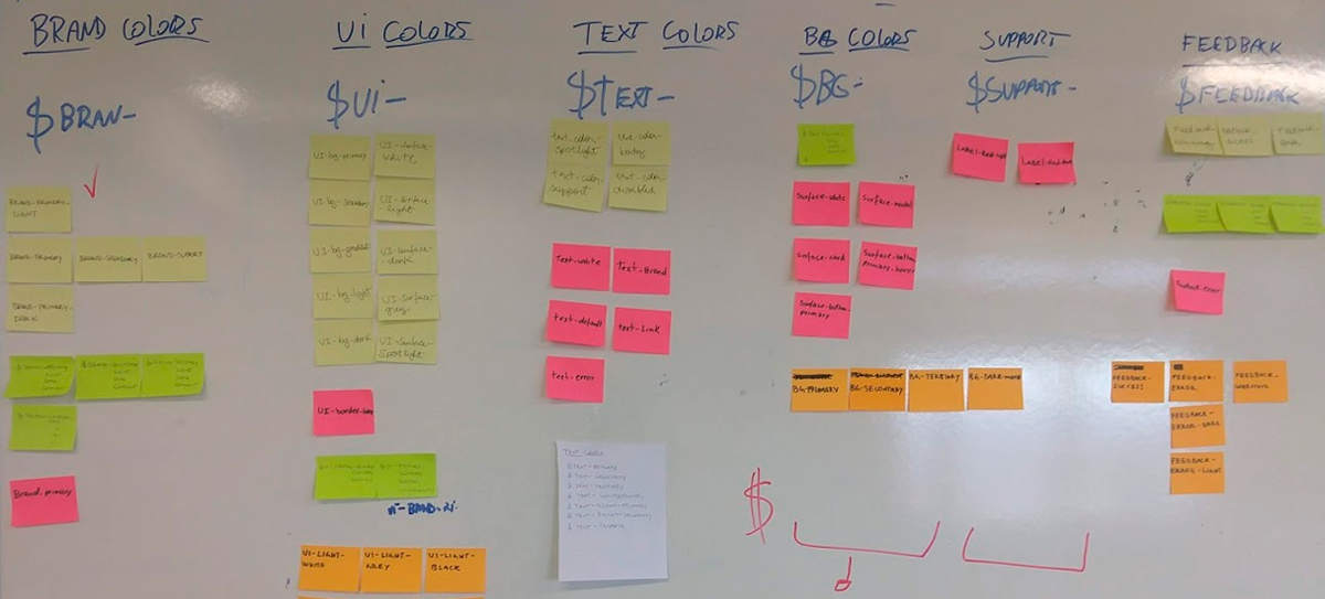
This part of the activity, divided the colors by definition, inside this definitions, it was used the terms primary, secondary, tertiary to make a hierarchy
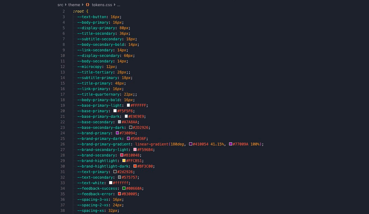
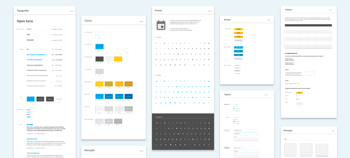
Some part of developer's repository with the same tokens used in design's library
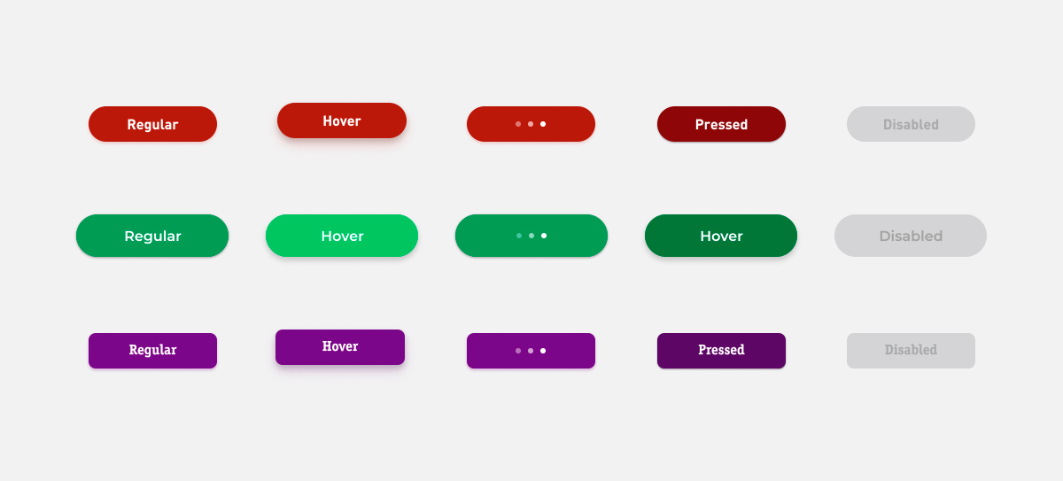
Primary Button' s anatomy examples using Be Water . They have se same strucutre and tokens (brand colors, shapes, spacing, text), but changed by themes (Claro, Zelas Conecta and Vivo themes respectively)
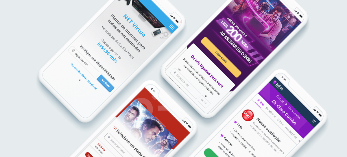
Some websites created by Be Water's sctructure